Thursday, February 27, 2014

A Repeat Alphabet Lesson...

I put away the last Alphabet Tilted Star block in frustration - the letter block felt squished to me, my seams weren't lining up.  Everything just seemed off, so I set it aside.  But the wheels haven't stopped turning.


I think that my biggest concern is the size and spacing of the alphabet letter blocks in the First Alphabet Lesson panel.  I've got some serious fringe on the top line, the text and most of the capital letters are 1/8" or less away from the dashed line, so there's not a millimeter to spare here for decent seams.  I hate to be sewing over that text - it's what makes the blocks so sweet!  But if I skimp on the seam allowance, all I can imagine happening is tons of work on a quilt - especially a baby or child's quilt - and in the first wash, seams will be popping all over the place.

Walking through the living room the next day, I spied my Circle Peeps quilt and suddenly everything clicked.  Why not use the same double-hitter technique of Wonder Under and a tight zigzag stitch to applique the letter blocks to a plain white square?


So here we go again - and this time I kept the template at its original 100% size...


Love it.  Seams are matched perfectly, squared totally without trimming and no text or letters in the block are cut off!


I know the raw edge applique makes it look a little less polished to some, but I think its a great way to keep the cute text of the alphabet blocks without compromising the block's integrity in the long run.


What do you all think?  Agree or politely disagree?

Linking up:

Paper Piecing Party

Wednesday, February 26, 2014

Instead of ScrapBeeLicious...

Nanette of Yeah I Made That gave each of us in the ScrapBeeLicious hive a gift this month.  For her turn as Queen Bee, she decided that she didn't need any more blocks than she already had (now that's what I call restraint!) and asked us all to make something for ourselves and share the results.


It's been more than 2 years since I bought this adorable ABC panel and I've held onto it because I wanted to break it up in a fun way and do a different kind of baby quilt.  I just didn't have a very good idea about how to do it.


I've never been able to let go of the idea of a baby quilt with a black background and thought that the rectangles of the letters might lend themselves to being the center of a wonky star.


When I bought this amazing book last week, one block jumped out at me as possibly being perfect to marry all these ideas together - the Tilted Star.  A great idea!  Or so I thought...

I ran into some problems - the text in some rectangles comes ridiculously close to the dashed lines, not giving much of a seam allowance.  First I had to add some white Kona to square it off.  I'm not sure it looks the best.  Maybe it would look better if it was completely surrounded by solid instead of only on two sides?


Then the original block (which is both paper pieced and has partial seams) is 12.5" square.  If you're doing a block per letter would make a pretty BIG baby quilt, so I reduced it down to 80% and made my test block.  The seams are off...really off.  Obviously, my math went wrong somewhere along the way...Maybe I should just do some free formed wonky stars instead of being so OCD and following a pattern?  I don't know.  I have more questions than firm ideas at the moment.

I love the general idea but am still not sold on forging ahead with a whole new project that might end up looking wonky in a bad way.  Or maybe I'm just in a lousy mood and need to test again to see if I was just being careless?

Linking up:

WIP Wednesday at Freshly Pieced

Friday, February 21, 2014

What's Bigger Than a Binge?

I've gone on some pretty good fabric buying binges before.  But while everyone else in the blogosphere seems to be doing some super productive destashing, I've been on the mother of all fabric buying sprees.  It's practically a buffet.


I can't tell whether this has been fueled by my discovery that I was pretty far under what I anticipated spending on fabric during 2013, the Fabric Extravaganza that is happening this weekend in Nashua, NH where there are some amazing fabrics available at $4-5 a yard(!!!), or by my current frustration at my feather quilt (which means that I'm itching to start something new and fresh), but either way I think I need an intervention.

Some Kate Spain and Amy Butler earmarked for some spring/summer dresses
The fabric that you're going to see the soonest put to good use is here - mostly made up of the Littlest collection from Art Gallery fabrics.  This is a super sweet collection that I'm going to use for a baby quilt to send off to family further away.  They don't know if they are having a boy or girl yet, so this gives me lots of opportunities for a beautiful combination of mint green, apricot and greys.


I added in some more random fat quarters, but I'm undecided between these two yellows - any opinions on which fits in best?


Here they are all together along with a cozy grey and light yellow flannel that I got for the backing.  It's going to be so pretty!!


Of course with some more black and white herringbone blocks to finish, I couldn't resist the call of some more black and white prints to add in...


And then a few more random fat quarters and cuts that I couldn't resist...


When I added it all up, there's 20 yards of fabric here. Granted, this includes larger cuts meant for clothing and quilt backings, but still.  20.  Yards.  People.

Oh, and did I mention that 4 more yards are still coming in the mail to finish up what I need for the feather quilt backing and binding?  You know what...forget I even just said that.

Wednesday, February 12, 2014

No No No No No...

Things were plugging along quite nicely this weekend.  I had finished all my feathers and had a good layout all sketched out.  I went back to the store to get 5 more yards of Kona Bone to fill in all the negative space in my rows (those are some TALL rows at 18.5"!), done all my prewashing and cutting and was happily sewing and ironing away.   It was shaping up to be the largest quilt I've ever done - queen sized!! - and I was feeling pretty darn proud.

Half of the quilt top was done and I was optimistic that it would be done by the early afternoon and my only worry would be the great quilting dilemma.  And with the iron still in my hand and the top spread out in the bright sunlight from the ONE window in our apartment that lets in lots of good natural light, it all came to a screeching halt.

Some bad words were uttered as I sprinted the entire top outside to see it in the natural light.


Can't see the problem?  Let me zoom in for you and drop down the lighting a bit...


Still a little muddy?  Allow me to turn into Dateline for a second and pull out my fancy UV light through photoshopping...


Spots and splotches.  Bright white (in natural light) on my Kona bone background fabric.  A few smaller spots within my feather blocks, but the largest and most obvious culprits were on the larger strips at the beginning and ends of my rows. At first I wondered if it was some kind of starch residue or something from my Best Press (didn't seem likely) or possibly something going wrong from my iron.  I still had some big pieces that hadn't been ironed or cut yet - but they had white splotches too.

Unless it was some majorly bad problem with the dye lot right off the bolt (again not likely), something bad had happened when I prewashed.  I never use bleach in my machine, but that's exactly what my fabric looked like - someone had splashed bleach all over it.  When I posted the problem onto a modern quilting group online, someone suggested that some detergents with nonbleach whitening agents can lift the color out of tan/beige color dyes if it sits on the fabric undiluted while the machine fills with water.  It seems like that must have been what happened but it's never something that has happened with clothing or fabric before.

Blerg.  It's really something that you do have to look for to see...but of course once you know it's there, that's all you can see.  I can't believe that I missed it while I was cutting, but I've been doing a lot of cutting at night when the kids are in bed under my kitchen's fantastic fluorescent lights where the splotches are virtually invisible.  Granted, this is a quilt for ME so it's not like I'm accountable to anyone else for any mistakes or imperfections, but what a stinking disappointment!!

So here's the NEW dilemma...obviously I'm going back to the store to buy some new unspotted Bone.  Do I simply worry about finishing the top half and moving on (and hoping that no one else notices the bottom splotches once it's all done) or do I go back and rip out the pieces that have spots so that I'm not going forward with something that bothers me?  I'm leaning towards ripping them out, but am all ears as to what YOU would do.  Help!

Linking up:
WIP Wednesday at Freshly Pieced

Thursday, February 6, 2014

Feather Frenzy 2.0...

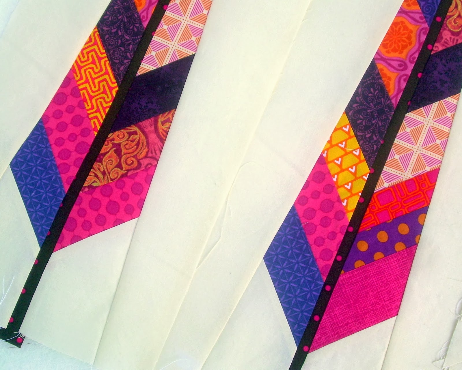
Well I'm deep into another feather frenzy with a few very small changes...


First of all, I'm actually using my old (and correctly sized) templates.  Second of all, I made a very slight color correction in my fabric choices.

My original color inspiration
Looking over my few old blocks, I like all the fabrics individually but I was purposely trying to choose fabrics that had multiple colors and larger prints in my purple/magenta/orange color scheme.


These did all fit the bill, but especially in the photos I notice that the orange is really crowding out the pink and making it fade into the background.  Magenta can fade into the background, you wonder?  Apparently so!  I think I read the other day that this effect is called vibration - lots of really interesting color posts in the blogosphere lately by the way!

To try and correct this effect without being too drastic, I went back into my stash to pull out an extra bluish purple and a few monochromatic magentas.  When you add those into the mix...

New blocks on the left and old blocks on the right
Its subtle, but I definitely feel a little less orange and a little more balance!  What do you think?  I'm hoping that over an entire quilt top, it will have just the right mix of all three colors.  I'm also planning on making one or two mostly purple feathers just for some extra interest.


Lastly, in Rachel's ScrapBeeLicious request, she linked to this post at Olivia Jane Handcrafted that had some great suggestions on how to greatly reduce the amount of fabric waste that the original feather pattern created.  The Anna Maria Horner pattern asks you to create strips that are the entire width of the fabric.  This creates huge triangles of wasted fabric at each end and also doesn't give you nearly as much variety in your feathers.  Meredith's tutorial first uses strips that are 22" long - or about half your width of fabric - and then staggers them down the 45 degree angle.  Here's the difference:

Waste from original blocks on the right and from Olivia Jane Handcrafted's tutorial on the left
A lot less waste and much more feather variety! Who knows - I might be close to having a quilt top soon and this project might not make a repeat retreat appearance after all!

Sunday, February 2, 2014

ScrapBeeLicious Rookie Mistake....

Just a few days late, I finally got going on Rachel's blocks as her turn on the ScrapBeeLicious Queen Bee throne.  She requested Anna Maria Horner's feather block in bold jewel tones on a cream or neutral background.


Now, I've done this block before and my few finished blocks are sitting ignored in their very own WIP box...but instead of digging out my old templates, I went back and lazily just printed out new ones.  This seemed like no big deal at the time and I churned out my blocks fairly easily with a Kona bone solid for my background fabric.

And then when they were all done, I squared and measured them to make sure that they were a-ok before mailing them on their merry way.  Oh. Crap.


These lovely blocks are supposed to finish at 9.5" x 18.5" a piece.  Mine were more like 8.5" x 17.25".  What the heck happened??  My best guess is that good old rookie mistake of not switching the "fit to page" to "actual size" detail when printing out the pattern pieces.  Ugh - so dumb.


I was all set to raid my scrap bin again and do them over the right way - albeit even later than these already are.  However, I am pretty fortunate that Rachel is a good and benevolent queen and told me to just send them along as is.  Lesson learned kids - always check that stupid printer dialog box.  Always.

The bright spot in this sorry tale is that I'm already starting to dig back into that WIP box to bring my feathers back into the daylight and check one more WIP off my list.  And bonus - it's a project that's just for me!  No deadlines, no obligations.  Those are by far the best kind of projects to enjoy.